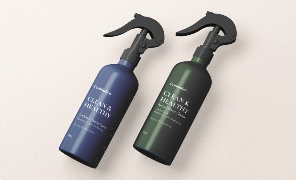
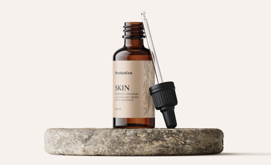
One of our exclusive projects is a collaboration with a brand ProbioEcodeveloping synergistic body and home care products with prebiotics and probiotics. For this project, Rekoprint not only took care of the printing, but also of the packaging design solutions to reflect the brand philosophy - cleanliness, balance and natural harmony. Packaging design for cosmetics - it's not just a visual, it's a sensation. Creating ProbioEco packaging, we aimed for aesthetic cleanliness, naturalness and trust. Minimalist styling, natural colours and clean typography became the key to a brand identity that could be trusted.
The visual solution combined two worlds - the modern image of beauty products and the profound rationale behind probiotics.


The client about cooperation:
"The layouts look great - very aesthetic, subtle and at the same time a strong communication of our values. It feels like a lot of attention to detail and a visual sense of balance. Thank you to the team for their professional approach, quick communication and ability to feel the spirit of our brand. We hope this is just the first of many joint projects!"
- ProbioEco team
Moments like these remind us why we create - not just design, but experience. Thank you ProbioEco for your trust and we are delighted to have been able to contribute to the visual journey of an exceptional brand.
Visual direction: soft aesthetics, clear identity
When designing ProbioEco's packaging, the main objective was to convey natural and professional in one. To do this, the following directions were chosen:
- Minimalist typography conveys confidence and quality in a classic font;
- Cream, beige, dark green and blue colours visually differentiate different product lines while maintaining a coherent identity;
- Organic textures labels subtly remind us of the living microbiome - the fundamental principle behind the products.
Functionality and print quality
"Rekoprint not only took care of the design, but also the high quality printing of self-adhesive labelswhich must be able to withstand humidity, heavy use in the bathroom and prolonged contact with products. Print solutions included:
- Accurate colour reproduction according to the brandbook (Pantone);
- Use of resistant and sustainable materials;
- Efficient coordination of print and layoutto ensure smooth production.
Result
The result is products that not only look great on the shelf, but also convey the brand's values - science-based health, sustainability and cleanliness.
Looking for someone to create a visual identity for your product from concept to print? Contact the Rekoprint team.
