Every brand has its own story. "Rekoprint is no exception. It's a story of an idea, determination and the belief that printing can be more than just a technical process - it can be a creative experience that creates value for businesses and peopleEvery brand has a story. How the Rekoprint brand was born - is a story about the idea, the determination and the belief that printing can be more than just a technical process, but a creative experience that creates value for business and people.
Why Rekoprint?
The name "Rekoprint" has two parts:
- "Reko" - symbolises record quality, speed and accuracy.
- "Print" - the press, the heart of our work.
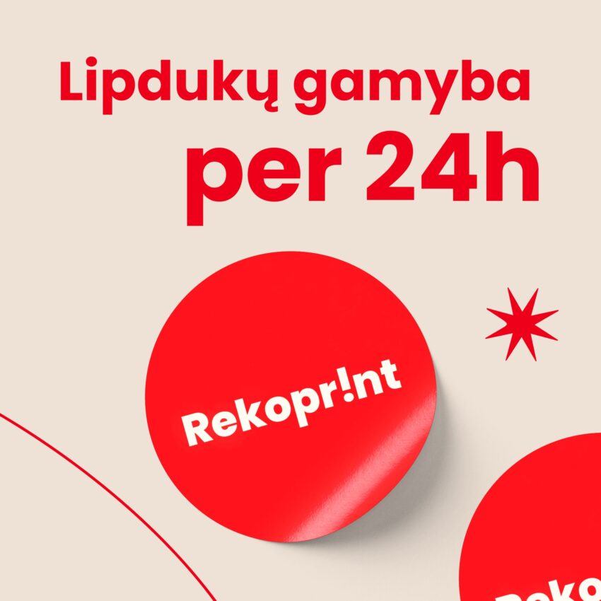
From the very first days, we wanted this name to send a clear message: we are working record performance and reliabilityand every print job must meet the highest standard. But the title alone was not enough - we had to create a strong visual identityto make our brand recognisable and memorable. Rekoprint advertising
Red colour and exclamation mark
We chose the colour red in the logo, because it symbolises energy, speed, courage and drive - that's the message we wanted to send about our work. We added exclamation markwhich reinforces our character - we are not afraid to say out loud that we provide printing services rekordiškai Good. Hi, we are REKOPRINT
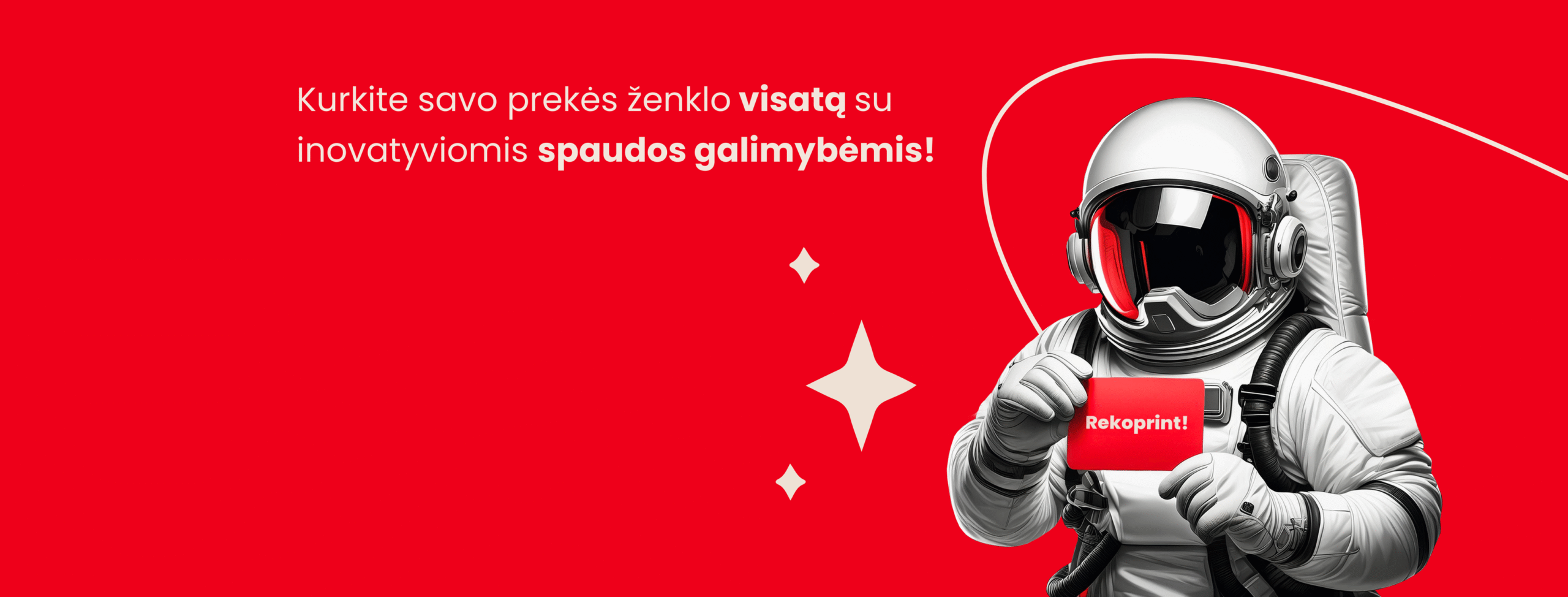
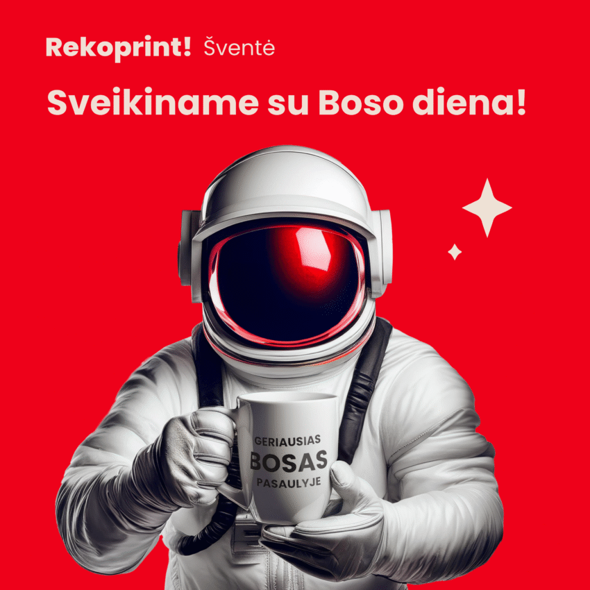
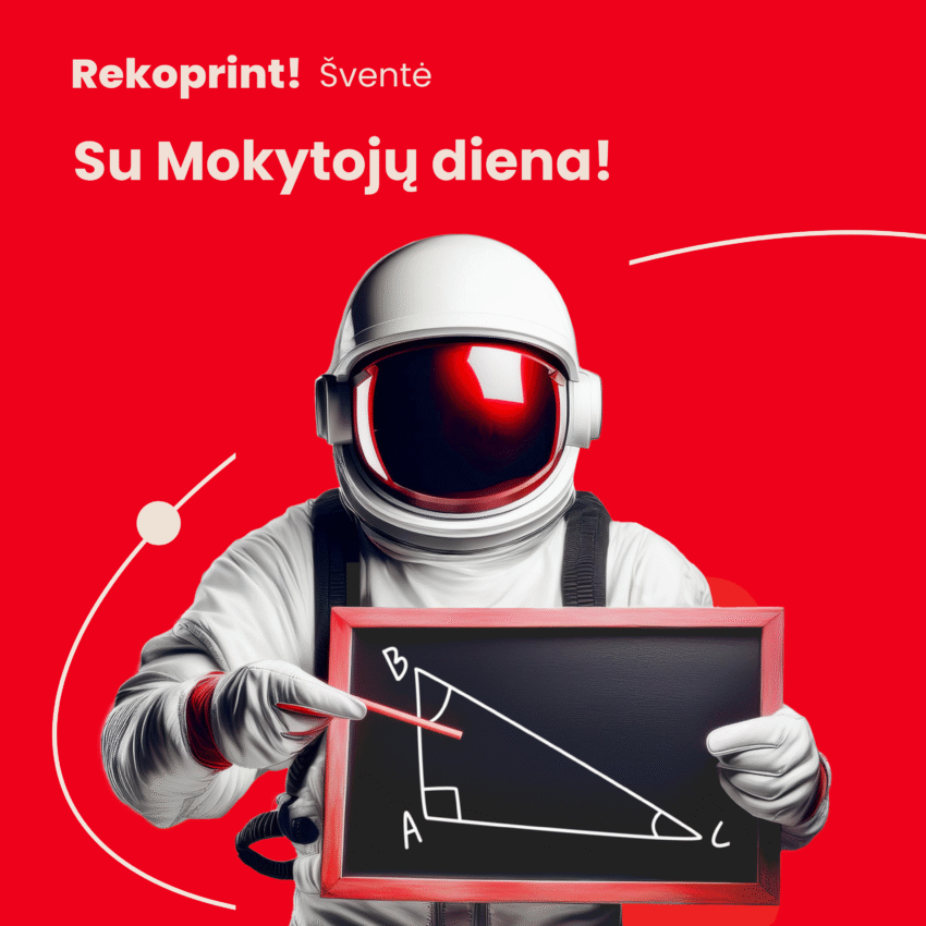
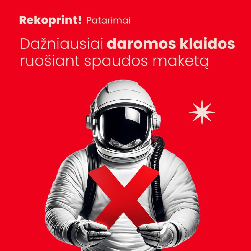
The astronaut is our face
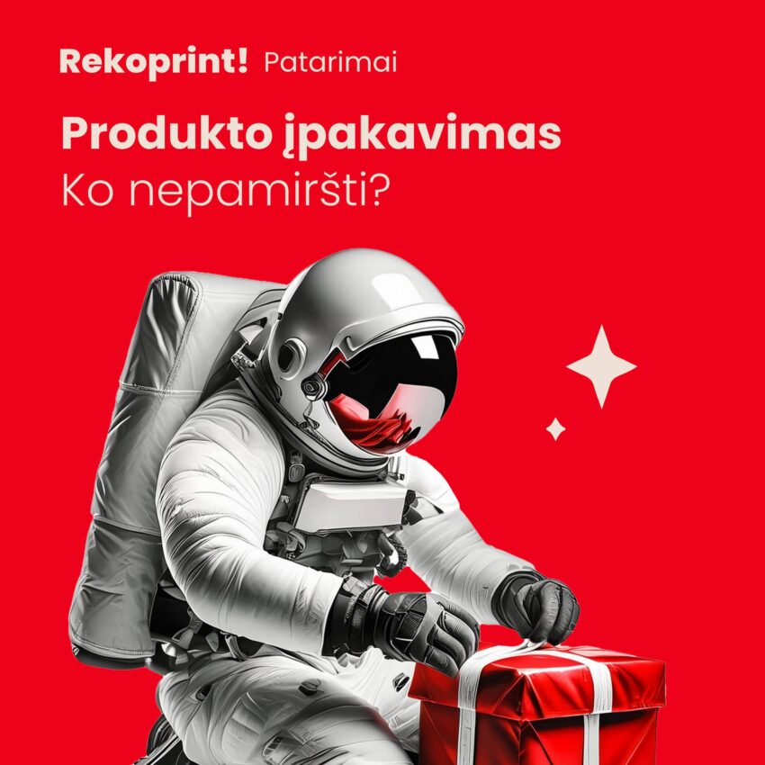
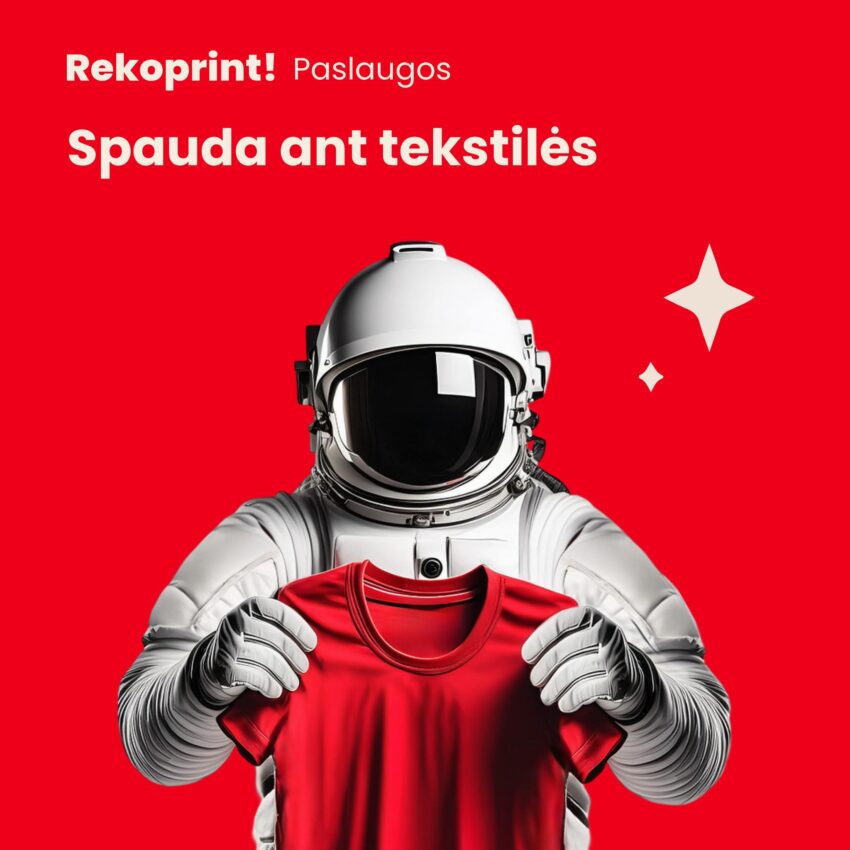
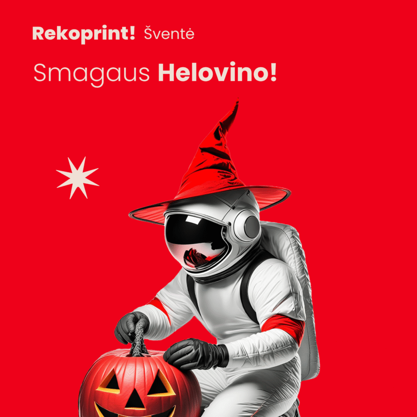
We have chosen the symbol astronaut. It reflects our commitment to go beyond the limits of the Earth, to explore new ideas and to always go beyond what the customer expects. Just as an astronaut ventures into uncharted worlds, Rekoprint seeks new creative and technological solutions.
Space themes
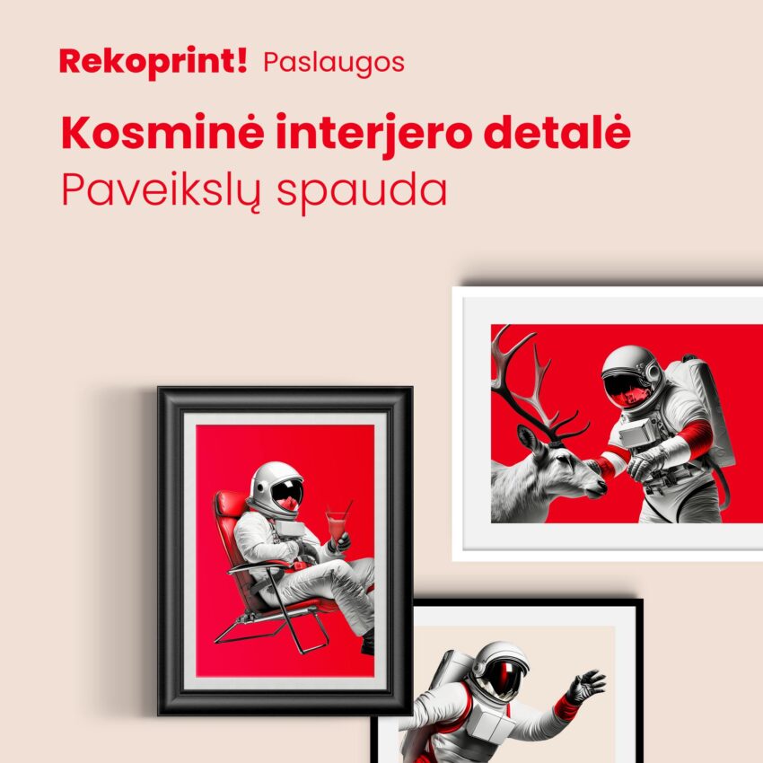
"Space-age press", "space-quality", "our work is space" - these words have become part of our daily communication. They help us to maintain a unified tone, to stand out in the market and to create a brand that our customers remember.
Our symbol - the astronaut
When we created the Rekoprint brand, we wanted not only a name, but also symbolthat reflects our values and aspirations. We chose astronaut - a man who goes where no one has gone before, who seeks new horizons and pushes the boundaries.
The theme of space is close to us because it symbolises:
- Cosmic quality - every print job must be of the highest standard.
- Cosmic ideas - we boldly venture into new areas, from traditional printing to innovative projects.
That's why we use the words "cosmically", "cosmic", "cosmos" - because that's how we describe our approach to work. Our astronaut has become not just a visual element, but also brand metaphor - Rekoprint goes beyond the ground and reaches for the stars.
These choices have helped to create the Rekoprint brand, which is not only a print service provider but also a cosmically memorable business partner.
Peržiūrėkite mūsų spaudos gaminius – Spaudos paslaugos – užsisakykite internetu – Rekoprint
Plačiau apie mūsų dizaino paslaugas – https://rekoprint.lt/dizaino-maketavimo-paslaugos/
Contact us dėl užsakymų:
Tel..: +370 677 62068
Email: info@rekoprint.lt
Address: Vilnius, Lithuania
Rekoprint #BrendoIstorija #SpaudosPaslaugos #DizainoPaslaugos #LogotipoKūrimas #BrendoKūrimas #KosmosoDizainas #KosmiškaiGeraSpauda #Marketingas #VersloIdentitetas #Dizainas
